Nowadays TailwindCSS + CSS combo is 🔥, and I can say now, that it's production ready 🎉. Read further to Get started with Tailwind CSS, Let's go.
TailwindCSS is a different UI library, imagine it as a stylesheet with a bunch of pre-written CSS classes with good naming conventions.
In fact, you can start using it right now, it's that simple. Let's explore.
for example, if you want to give padding, you will write the following in CSS.
Padding
.container {
  padding: 12px;
}
so in tailwind CSS, we can do that in the following way:
  <div class="p-3">

  </div>
here, p-3 means padding of 12px. we can give padding to direction as well.
px-3 will evaluate to padding: 0 12px, on x-axis or Left and Right it will give Padding of 12px.
py-3 will evaluate to padding: 12px 0, on y-axis or Top and Bottom it will give Padding of 12px.
pt-3 will evaluate to padding-top: 12px, from top it will give Padding of 12px.
pb-3 will evaluate to padding-bottom: 12px, from bottom it will give Padding of 12px.
pl-3 will evaluate to padding-left: 12px, from Left it will give Padding of 12px.
pr-3 will evaluate to padding-right: 12px, from Right it will give Padding of 12px.
this works for margin as well.
Width and Height
we can provide width and height with class w-[size] and h-[size].
where size can be full, screen, min, max, fit or 0-96.
we can give % value too, so it will be like w-1/2. that will give width: 50%.
background color
we can provide background color with class name bg-[color] and there are lots of colors available, we can use our own choice of colors too with a little bit of configuration.
here is an example usage of background color.
<div class="w-10 h-10 rounded mt-4 bg-indigo-400">
</div>

<div class="w-10 h-10 rounded mt-4 bg-blue-400">
</div>

<div class="w-10 h-10 rounded mt-4 bg-orange-400">
</div>

<div class="w-10 h-10 rounded mt-4 bg-pink-400">
</div>

<div class="w-10 h-10 rounded mt-4 bg-gray-400">
</div>
the pre-defined colors come in different shades that we can use. shades range from [100-900].
Text color
Text color is can be used with text-[color], here is an example of that.
<p class="text-indigo-400">Indigo</p>
<p class="text-orange-400">Orange</p>
<p class="text-red-400">Red</p>
<p class="text-yellow-400">Yellow</p>
Font size and weight
<h1 class="text-base">Text Base</h1>
<h1 class="text-lg">Text Large</h1>
<h1 class="text-xl">Text XLarge</h1>
<h1 class="text-2xl">Text 2XLarge</h1>
<h1 class="text-3xl">Text 3XLarge</h1>
Few issues
I would like to discuss a few issues here, then we will continue building real components.
TailwindCSS gives you lots of classes, there will be classes for every CSS property. so if you are used to with bootstrap or other such libraries, at very first you will find bit different experience, but once you start using it, there will be no issue.
another concern is a bunch of inline CSS classes. take a look here,
<div class="relative p-3 col-start-1 row-start-1 flex flex-col-reverse rounded-lg bg-gradient-to-t from-black/75 via-black/0 sm:bg-none sm:row-start-2 sm:p-0 lg:row-start-1">
</div>
see in the example, there are lots of classes, for developers sometime it's very confusing if it's not in order. and this situation will become even worse if you are using TailwindCSS without and framework.
By using Framework, you can create templates for each component, by that way we can restructure it, and it will be easy to debug.
Real usage
input
Let's style input fields.
<div class="w-full h-screen bg-blue-400 flex items-center justify-center">
  <input
    type="text"
    placeholder="Write your name here..."
    class="px-4 py-2 rounded shadow-lg"
  />
</div>
Result:

Button
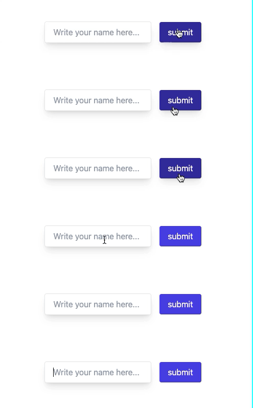
Creating a button is easy, we will also add transition effects, let's start.
<div class="w-full h-screen flex items-center justify-center space-x-4">
  <input
    type="text"
    placeholder="Write your name here..."
    class="px-4 py-2 rounded shadow-lg border outline-none"
  />

  <button class="text-white bg-indigo-600 rounded px-4 py-2 hover:shadow-lg hover:bg-indigo-800">
    submit
  </button>
</div>
Flex and Grid
if you want to make any element as flex or grid you can provide class flex or grid to it.
<div class="flex"></div>
and we can use all flex properties for it, here are all.
- align-center
- align-start
- align-end
- justify-between
- justify-around
- justify-evenly
- justify-start
- justify-center
- flex-row
- flex-col
- flex-wrap
Grid
The grid can be used by providing grid in a class of HTML elements. we can configure grid columns, in TailwindCSS we have 0-12 for columns and rows.
- grid-cols-[1-12]
- grid-rows-[1-6]
That's all for starting out, explore more while making projects, that's how I got into TailwindCSS 😄, Happy coding ✌️
if you readed till the end, you can like my article 🌟, Thanks.
About the author
I am Dhruvil, doing freelancing for App Development & UI/UX Design. I casually write here and share my knowledge and experience.
Comments
Join the discussionawesome article
Thanks Deepti Dubey 🌟