Guide to Flexbox

Today you will learn about Flexbox. Flexbox nowadays is used so much that you can't ignore it. I love the Flex system in CSS. they give so much control to position elements on the screen. so in this entire reading, we will see such a use case. Let's start.
Have you ever centered the element to screen using margin-top, well that's the old method now, and honestly not proper use.
Let's do it in the Flexbox way.
HTML:
<div class="container">
  <img src="https://asset-cdn.learnyst.com/assets/schools/2410/resources/images/logo_lco_4dsl6o.png" alt="img" class="lco-logo">
</div>
CSS:
.container {
  width: 100%;
  height: 100vh;
  display: flex;
  align-items: center;
  justify-content: center;
}
.lco-logo {
  width: 100px;
  height: 100px;
}
Result:

not only this, flexbox has many use cases, let's explore them one by one.
How to use flexbox
to use flexbox, we have to use display: flex; on the outer container. so we can use flexbox properties.
flex-direction
We can define flex-direction as either row or column. on the website when you use display: flex; by default direction will be row.
flex-direction: row | row-reverse | column | column-reverse;
Let's see the usage.
HTML:
<div class="container">
  <img src="https://asset-cdn.learnyst.com/assets/schools/2410/resources/images/logo_lco_4dsl6o.png" alt="img" class="lco-logo">
  <img src="https://asset-cdn.learnyst.com/assets/schools/2410/resources/images/logo_lco_4dsl6o.png" alt="img" class="lco-logo">
  <img src="https://asset-cdn.learnyst.com/assets/schools/2410/resources/images/logo_lco_4dsl6o.png" alt="img" class="lco-logo">
</div>
CSS:
.container {
  width: 100%;
  height: 100vh;
  display: flex;
  align-items: center;
  justify-content: center;

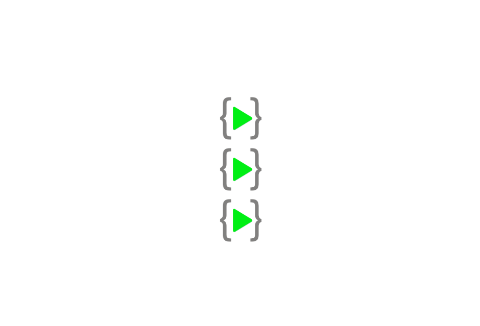
  flex-direction: column;
}
.lco-logo {
  width: 100px;
  height: 100px;
}
Result:

justify-content
justify content works on the main axis, if flex-direction is set to row then justify-content align content on row. let's see example.
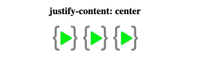
justify-content: center
.container {
  width: 100%;
  height: 100vh;
  display: flex;
  justify-content: center;
}
.lco-logo {
  width: 100px;
  height: 100px;
}

justify-content: space-between
.container {
  width: 100%;
  height: 100vh;
  display: flex;
  justify-content: space-between;
}
.lco-logo {
  width: 100px;
  height: 100px;
}

similarly, we have space-around and space-evenly, flex-start, flex-end.

align-items
this property works on a different axis, we can call it a secondary axis, if the direction is set to row, this will work on top-to-bottom.
align-items: flex-start | flex-end | center
flex-wrap
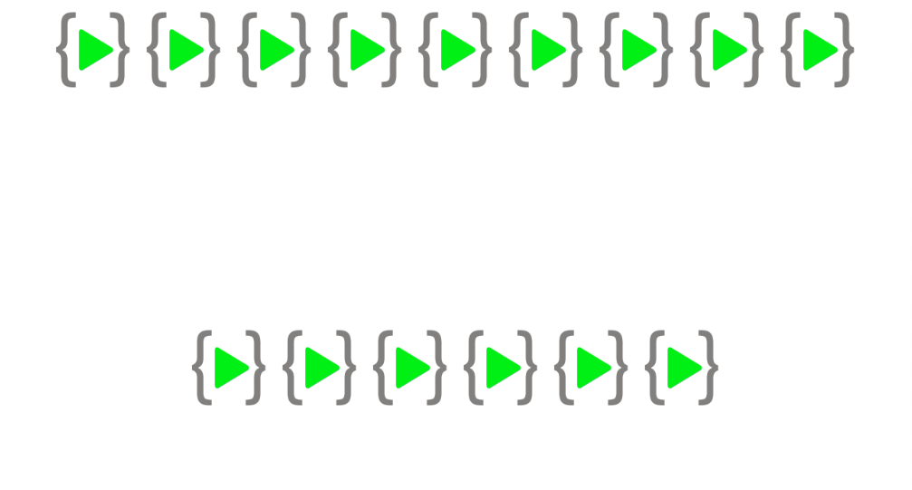
flex wrap is very useful when the content is overflowing, or squizzing into the container, we can use the wrap, so the remaining items will be moved to the next line.
without flex-wrap

with flex-wrap
.container {
  flex-wrap: wrap;
}


