Deep dive into CSS position & Some practical usage
We all love good-looking websites, no one likes a bad User interface, and guess what position is property you can master to create some good websites.

Let's start learning by practical use case, are you excited? 😁
1) position: fixed;
We use Instagram, Facebook, LinkedIn, or some social platform. Then you must know there is a header at the top that stays at the top, regardless of what we do, whether we scroll or not, it just stays on top.

.header {
  position: fixed:
  top: 0;
  left: 0;
  right: 0;
}
by setting position property in CSS, you also can use top, left, right, and bottom properties to give the position.
in this example, I assigned 0 to the top, left & right because I want the header to stick to the top.
One more example

You might see this kind of chat box in the bottom-right corner of some websites. well implementing this kind of style is very easy.
.chat-popup {
  position: fixed;
  bottom: 20px;
  right: 20px;
}
see here I added 20px from bottom and right, so it gets some space from corners, and add some nice spacing.
now you can visualize twitter's menu too, Twitter has a sticky menu on the left side, and right side, on the left side there is navigation, on the right side, some trending hashtags, and on the center, there is a feed.
now, let's move to the next example.
2) position: relative;
this one is very simple, we can position the element with top, left, right, and bottom properties and the element will position itself relative to its position.
usually, this is used with position: absolute; I'll show you in the next one the combined usage of both.
3) position: absolute;

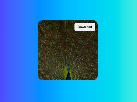
See the image, there is a download button on top of the image, these types of UIs are very common and very useful. here is the code for doing exactly the same.
<div class="image-box">
  <img src="https://images.unsplash.com/photo-1657112016041-080a8f4b7a0e?ixlib=rb-1.2.1&ixid=MnwxMjA3fDB8MHxwaG90by1wYWdlfHx8fGVufDB8fHx8&auto=format&fit=crop&w=434&q=80" alt="image" />
  <button>Download</button>
</div>
.image-box {
  position: relative;
}

.image-box img {
  width: 250px;
  height: 250px;
  object-fit: cover;
  border-radius: 18px;
}

.image-box button {
  position: absolute;
  top: 10px;
  right: 10px;
}
explanation: First we made .image-box position: relative; then the important code is for the button, we've to use position: absolute; so the button's position will be an absolute position to its parent, so in our example the parent of a button is .image-box, then we provided top and right position to align it to the top-right corner.
4) position: static;
Whether you write it or not, this is the default assignment, by DOM renderers.
5) position: sticky;
This is very useful, consider it as a combination of the position: static; and position: fixed;
when you use this, the content will be statically positioned, but when you scroll and the given position (top, left, right, bottom) matches to current position then it sticks to that position.
HTML
<div class="header">
  <button>Full resolution</button>
  <button>4k</button>
  <button>Full HD</button>
</div>
CSS
.header {
  position: sticky;
  top: 0;
  left: 0;
  right: 0;
}
it was pretty long 🥲 and took me around 2-4 hours to prepare demos and write this blog, if you enjoyed it, Give it like 👍🏻 and share it with your friends.
Happy coding! 👨🏻💻 Bye.


