Easiest guide for using pseudo selectors and elements in CSS

There are lots of pseudo selectors in CSS, so in this blog, I am covering the practical usage of such selectors.
Pseudo selectors are very powerful, you will understand this by end of this blog. Let's start exploring 🚀
:root
Ever ran into a situation where your designers tell you that the purple color is going to be replaced with blue! 🥶 in your product site. and I am not joking, that color may be used by thousands of classes in your CSS. it will take lots of time if you do this manually to change color.
well not anymore here is a lifesaver, save values in CSS variables using :root.
You can create variables to store any values, such as colors, size, etc.
Example
:root {
  --primary-color: #FFF9CA;
  --card-width: 140px;
  --font-size: 1rem;
}
this is just the definition part, to use these variables use var(variable-name) in CSS.
.card {
  background-color: var(--primary-color);
  font-size: var(--font-size);
  width: var(--card-width);
}
now, don't you worry, any drastic changes in design can be done in seconds. This is how in production we use variables and configuration. often we run into a situation where some font size is too big or too less, color might need to change when we ship the code, see these are very common situation that comes when you are working in real production code.
:hover
You're going to use this one quite a lot. this is useful when you want to apply to style when you hover on the element.
A few scenarios can be: moving the mouse cursor on top of the button and adding styling on image hover. Simply this is used to tell the user that there is an interaction on the element, like pressing a button. this adds to a good user experience.
Example
button {
  outline: none;
  border: none;
  background-color: #000;
  color: #fff;
  padding: 10px 14px;
  position: relative;
}

button:hover {
  background-color: #333;
  cursor: pointer;
}

this simply changes the background color of the button when the mouse is hovering on the button element. we can do anything that CSS supports, you can try some fancy options like transform, and filter of CSS.
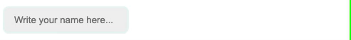
:focus
focus by name suggests, that when the element gets focused, styling will be applied. such as selecting input.
Example
input {
  border: 2px solid #E7F6F2;
  outline: none;
  background-color: #efefef;
  padding: 10px 14px;
  border-radius: 8px;
  transition: 100ms;
}

input:focus {
  border: 2px solid #2C3333;
}
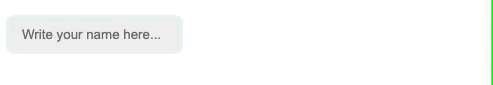
in the example, I just added a border, but it's not limited to it, it's CSS, and we can add any valid CSS properties.
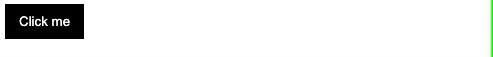
:active
this is useful when we want to add styles for any element that is active, For example: pressing button.
Example
button {
  outline: none;
  border: none;
  background-color: #000;
  color: #fff;
  padding: 10px 14px;
  position: relative;
  transition: 50ms;
}

button:hover {
  background-color: #333;
  cursor: pointer;
}

button:active {
  transform: scale(0.9);
}
:enabled :disabled
This is useful to select elements and style them for their state. For example, when some input fields are disabled for users to edit, we can change default styles.
Example
<input type="number" placeholder="Age" disabled />
input:disabled {
  cursor: not-allowed;
}
:first-child
h1:first-child {
  background-color: #D61C4E;
}
this will select the first h1 in the document and applies the given background color.
:last-child
h1:last-child {
  background-color: #D61C4E;
}
Usecase is similar to :first-child but it's for :last-child this will select the last h1 in the document and applies the given background color.
:nth-child(number|odd|even|formula)
I will explain this selector using <table>. what I want to achieve in design is that every odd row should get a different color. it's not that hard, in fact, it is very easy.
<table>
  <tr>
    <th>Title</th>
    <th>Age</th>
  </tr>
  <tr>
    <td>Mr. ABC</td>
    <td>33</td>
  </tr>
  <tr>
    <td>Mr. XYZ</td>
    <td>23</td>
  </tr>
   <tr>
    <td>Mr. PQR</td>
    <td>30</td>
  </tr>
</table>
td {
  padding: 10px;
}

tr:nth-child(odd) {
  background-color: #FCF8E8;
}
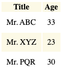
as you can see in the output, we can also achieve the same for the even rows. or let's say every third row, here is code for that.
/* odd rows */
tr:nth-child(odd) {
  background-color: #FCF8E8;
}

/* even rows */
tr:nth-child(even) {
  background-color: #FCF8E8;
}

/* only 5th element */
tr:nth-child(5) {
  background-color: #FCF8E8;
}

/* every 3rd element */
tr:nth-child(3n) {
  background-color: #FCF8E8;
}
::before
This selector has lots of usages, and designers love this and ::after too. using these two selectors you can craft designs that will amuse your users.
I am sharing some examples here.
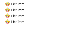
Example 1: use custom list style.
<ul>
  <li>List Item</li>
  <li>List Item</li>
  <li>List Item</li>
  <li>List Item</li>
</ul>
li {
  list-style: none;
}
li::before {
  content: "🤪 ";
}
Example 2: image gradient overlay
::after
after selector is applied after the content of the element.
Example 1: button design
button {
  border: none;
  outline: none;
  padding: 10px 12px;
  background-color: #000;
  color:white;
  position: relative;
  border-radius: 12px;
  font-size: 1.5rem;
}
button::after {
  content: "";
  position: absolute;
  z-index: -1;
  width: 100%;
  height: 100%;
  top: 5px;
  left: 5px;
  background-color: #1A4D2E;
  border-radius: 12px;
}

Example 2
<div class="center">

  <div class="card">
    <h1 class="quote">
      Stay Hungry, Stay Smart
    </h1>
  </div>

</div>
body {
    background: linear-gradient(45deg, #1363DF, #590696);
}
.center {
  font-family: sans-serif;
  font-size: 1.5rem;
  height: 100vh;
  display: flex;
  align-items: center;
  justify-content: center;
  flex-direction: column;
}

.card {
  background: #fff;
  color: #000;
  border-radius: 12px;
  padding: 38px 38px;
}

.quote::before {
  content: "😋";
}
.quote::after {
  content: "😇";
}

::selection
This can be used to change the style of the selected text.
p::selection {
  background-color: #D61C4E;
}
it was quite a lot, but there are many more too, learn them as you need them. if you liked the blog, I am glad that my 4-5 hours of work is worth it ❤️.
Happy coding 👍🏻